
When you’re walking through a grocery store, what type of products stand out to you the most? The design of the package will make or break whether a brand is noticeable on store shelves. When you’re designing graphics for food products your business sells, there are many elements you must consider to perfect the design. Grab your customers’ attention with stellar graphics!
Strive for Versatility
One mistake many businesses fall victim to is not designing a versatile graphic that can work on multiple packaging mediums. Creating an illustration that can only work on a specific packaging medium will hinder the ways you can use this design. For example, you might design a bag of large chips, but what happens when you branch out into single serving size and need to reconfigure the graphic for a smaller bag? Ensure your graphic design functions on all packaging types and sizes.
Keep Beauty, Function, and Form in Mind
To keep everything simple and concise, keep these three principles in mind: beauty, function, and form. Form relates to the size and shape of the product package, function relates to how it protects the product inside, and beauty relates to how the package grabs customers’ attention. When designing graphics for food products, keep these three principles in mind to create a package that sells yet keeps the product safe inside.
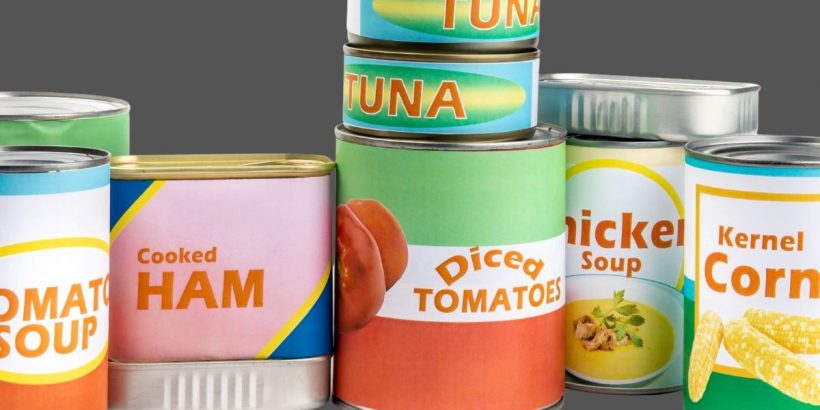
Be Mindful of the Color Palette and Printing Style
The colors you choose to include can invoke different feelings and emotions in a customer. For example, blue exhibits calmness and tranquility, which could be great for tea packaging! Be mindful of your chosen colors because they can influence who purchases your products. Additionally, know the difference between digital and offset printing because this will alter how your graphic looks on the package, further affecting who buys your products.
Be Careful Choosing a Typeface
One of the first elements on a package that a customer notices are the font and how it looks on the box. Never choose a popular overused font, such as Comic Sans, because it won’t look original and could turn off customers. Your font must be legible and large enough to catch someone’s attention. Don’t rush over this step in the design process because it’s crucial!
Create a Design for All Panels/Sides of the Package
Your package is much more than just the front-facing panel. You must also consider the graphic design for the FDA food regulations, including the ingredient list, nutritional facts, and other health claims. You also cannot forget about the back and the other side panel. Remember, you’re creating an experience for customers with these graphics, so the design must encompass the entire package.
The graphic design process is one of the most critical aspects of creating a package for your products. This is the first thing someone sees on store shelves, so it needs to be attention-grabbing for this person to pick up the product and decide to purchase it.
However, creating this graphic is more complex than one might expect. There are a lot of different elements that factor in. You’re more likely to make mistakes when rushing, so take your time. Consider the aspects we mentioned here to ensure the process goes smoothly and you don’t miss anything.