Braille signs create an accessible environment for people with visual impairments. They ensure that everyone, regardless of their vision, can safely and confidently navigate spaces such as public buildings, workplaces, and transportation hubs.
Designing effective braille signage requires attention to specific features that enhance usability and accessibility. Below, we’ll explore the important features of a braille sign that make it functional and compliant with accessibility standards.
Tactile Characters
A defining feature of all braille signs is the inclusion of tactile characters. These raised characters or symbols ensure information is accessible to individuals with visual impairments. The characters should adhere to a standardized size and height, allowing them to be easily distinguishable by touch.
For example, letters and numbers must have appropriate spacing so a person can feel them individually, preventing any confusion. Tactile characters aren’t just functional; they also communicate a commitment to inclusivity, ensuring that everyone can independently access the information they need.
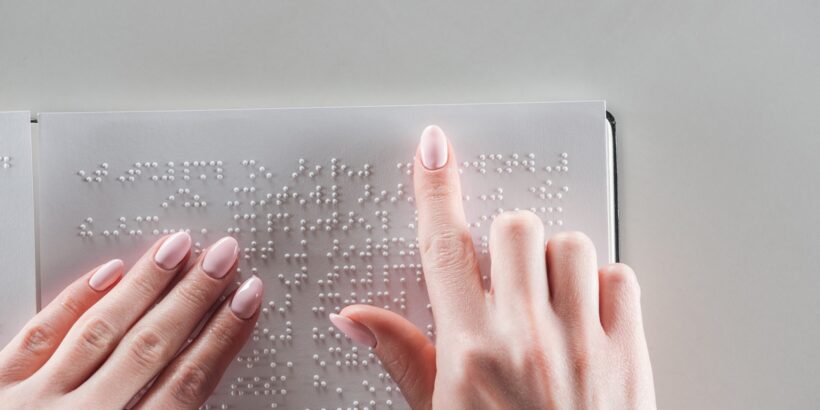
Braille Dots
Another essential element is the braille itself. These raised dots are the foundation of the sign and must conform to specific standards for accurate readability. Each braille cell typically consists of six to eight dots arranged in a rectangular formation, representing individual letters, numbers, or symbols.
The precision in the dot height, spacing, and alignment is critical in making the text easy to read through touch. Poorly constructed braille that feels uneven or unclear diminishes usability and can deter users from engaging with the sign. Therefore, attention to detail in braille dot design is nonnegotiable.
Contrast
Contrast between the sign’s background and its tactile characters, including braille, is essential for users with partial or low vision. A high-contrast color scheme ensures that any remaining vision can assist in identifying the information on the sign.
Ideally, pairing light-colored characters with a dark background or vice versa offers the best visibility. Poor contrast can make the sign inaccessible, defeating its purpose. Aside from color, materials that reflect light effectively and avoid glare can further improve the visual experience.
Placement
Proper placement of braille signs is critical to ensure they’re functional. Install these signs at specific heights and positions to make them easy for visually impaired individuals to locate and use.
Place braille signs where they’re accessible by touch, ideally mounted on walls at a standard height between 48 to 60 inches from the floor. They should be located near doorways or pathways with adequate clearance. Placement ensures convenience as well as compliance with accessibility guidelines.
Finish
The finish on braille signage is important because it plays a key role in usability. A matte or nonreflective finish is essential to reduce glare and improve visibility for those with partial sight.
Additionally, the material must have a smooth surface to make tactile characters and braille comfortable to read. Using durable materials ensures that the braille dots do not fade or flatten over time, maintaining effectiveness for years to come.
Ensure Inclusivity and Empower Individuals
Incorporating these important features of a braille sign ensures inclusivity and empowers individuals with visual impairments to independently and confidently access their environment. Employ these insights to build a truly accessible environment, one sign at a time.